
Redesign for MyChart COVID-19 Feature
UI Design + UX Research
Jan-Mar, 2022
Overview
Over 10 weeks, my team and I were motivated to redesign the MyChart app's COVID-19 feature to make it more informative, personal, and easier to navigate so that our peers’ anxieties can be alleviated.
Role --- UI/UX Designer
Scope --- UI Design, Interaction Design, Visual Design, UX Research
Team --- Chia-yu Chang, Sophia Rui, Zoe Xu
Platform --- Mobile app
Tool --- Figma, Figma, Zoom, Google Sheets, LucidChart
Interact with MyChart mobile app Prototype 👀
Why did we choose the Covid-19 feature?
When you tested positive for COVID-19 but do not know where you should go for treatment? When you are exposed to COVID-19 but do not know what you should do next? When you have some suspected COVID-19 symptoms but do not where to get tested?
MyChart is a powerful platform for users to see their medications, test results, upcoming appointments, and more all in one place…
Specifically, we chose to redesign the COVID-19 feature for the MyChart app, the UCSD Health-sponsored app, because pandemic-related anxieties had been surging amongst our UCSD student peers. We aimed to redesign MyChart’s COVID-19 feature in order to raise awareness of COVID-19 while reducing anxiety in students.
What are the MyChart Problems?

Due to the recent outbreak of COVID-19 cases, MyChart mobile app needs to have a high accessibility to COVID-19-related information in order to help UCSD students to overcome physical and emotional difficulties during this challenging time with available resources provided by the school, releasing UCSD students’ feelings of anxiousness about their inability to access immediate COVID-19-related information and services.
Research Finding Summary
User Research
Because the MyChart app had a high cognitive load, our research goal was to improve efficiency by reducing the steps to make that can achieve the user’s goal. Additionally, our research goal was also to provide transparency and immediate notification regarding the information about COVID-19 to UCSD students. Furthermore, we would like to change the design of the app to fit into a welcoming atmosphere so that more students are voluntarily willing to use it.
With those goals and considerations, we designed our research questions and chose direct observation and survey as our research method. We interviewed 8 participants and collected 50 surveys for analysis. We observed the interviewees' interactions and recorded their feedback.
We concluded three main pain points for the MyChart mobile app as the research findings:


Pain Point
Main Page:
- The UI design of the main page is unorganized and not informative. Too much unnecessary information and sections in the main page.
- Unable to minimize sections.

Pain Point
Main Page:
Unimportant sections appear in hamburgers, such as “Customer Support” and “Billing Summary”.


Pain Point
Menu + COVID-19 Page:
Covid-19 information is not centralized into one place. The information is all over the place.
Personas
Because MyChart is a to B platform designed for UCSD users, we identified two personas to represent UCSD students from different perspectives and with various frustrations.


How can we SOLVE those problems?
Based on research findings, we are motivated to redesign the MyChart app to make it more informative, personal, and easier to navigate so that our peers’ anxieties can be alleviated. To achieve solve those problems, we concluded three major approaches to improve the MyChart app:
Approach 1: More COVID-19-related information for students to find comprehensive
information about the pandemic.
Approach 2: Provide quick access to COVID-19 testing and vaccination such that the
students can schedule appointments easily.
Approach 3: The flow and interface should be redesigned in a way that makes students
feel welcomed and reassured.
Our Design Process
UX Flow
Before designing the layout and interfaces, we created the UX flow to show how users can access the COVID-19 feature directly through the Main Page and how the Appointment and Help features interact with the COVID-19 feature.

My team and I specifically designed the user flow to access COVID-19 pages, because users reflected that they were hard to navigate themselves to use these functions for the original MyChart design. For our new COVID-19 feature, there are two subsections:
1. Personal COVID-19 info contains features such as scheduled COVID-19 vaccination and test, test results, and digital vaccination records, easier for users to access the service and use it.
2. Help Resource provides COVID-19-related information, such as what to do if you are positive/exposed, which releases users' anxiety and stress.

UI Sketch
We decided to draw two different sketches based on our UX flow before we start to create lo-fi prototypes. We used separate layouts for two sketches to emphasize different features.

UI Sketch 1

UI Sketch 2
Iterations on lo-fi prototypes
We created lo-fi prototypes for both UI sketches. By visualizing the interfaces and fundamental interactions, we were able to take AB user tests. We invited 4 participants to take our test. Based on our observation and users' feedback, we gathered the following findings:
Lo-fi sketch 1

Lo-fi sketch 2


Main Page
We decide to use sketch 2, because:
1. QR code icon is presented with a description, which explains the icon's functionality to users.
2. Users think the sketch 2 layout is more organized.
Low-fi sketch 1

Low-fi sketch 2

COVID-19 Page
We decide to use sketch 1, because:
1. Categories are more specific to increase intuitiveness for users to faster access the service/info.
2. Users think the sketch 1 layout is more organized.
Overall, our participants were equally like two sketches with different UI designs and features, and there was no strong preference for either one. Thus, we decided to combine features from both flows and create a new flow for our final prototype that included COVID-19, Appointment (COVID-19 related), and Help (COVID-19 related) pages.
Sketch 1 + Sketch 2 = FINAL PROTOTYPE
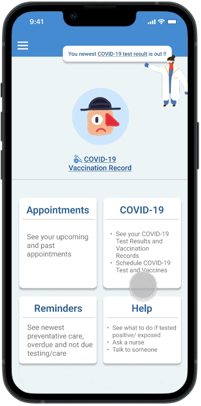
✨ Final Design
For the visual design of the final high-fi prototype, we readjusted the sizes of some tabs and buttons to make them appear cleaner and more consistent. We decided to follow the original color scheme of MyChart since we wanted to feel comfortable with the product from the way before. Also, the original blue color scheme conveys medical feelings which would make users feel relieved. We add graphics to the screens to make the app friendlier and more familiar, thus soothing the users’ anxieties.
For High-fi prototype, based on usability testing, we finalize the prototype:
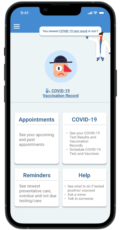
COVID-19 Vaccination
Users are able to access their COVID-19 Vaccination Record through the COVID-19 subsection or the shortcut on the homepage.
Add the Schedule COVID-19 Vaccine function on the page to provide convenience for the users to act less to achieve what they need.
Schedule COVID-19 Vaccination
For schedule COVID-19 vaccine flow, we expand the subsection for Pharmacy.
We design the all following options of subsections on one page, users can easily scroll down to fill out the information and complete the task.
COVID-19 Test
Users are able to access their newest COVID-19 test information through the notification on the homepage or the COVID-19 section.
Adding the Schedule COVID-19 Test function on the page provides convenience for the users to act less to achieve what they need.
Schedule COVID-19 Test
To schedule the COVID-19 test flow, we expand the subsection for Vending Machines, Pharmacies, and Drive-up.
For the Pharmacy section, we design the test type as a filter to flit locations for users' specific needs.

COVID-19 Functionality in Appointment Page
We add functions on the Appointment page to enable Users to schedule a new COVID-19 test or vaccine appointment, providing more accessibility and efficiency for the app.
COVID-19 Functionality in Help Page
We add helpful resources for both the COVID-19 page and the Help page to release users' anxiety because we hope that the users can get online resources faster when they are diagnosed with COVID-19 since they cannot go to the student health center to ask for medical advice or treatment.
Reflection
1. User-Centered Design
For this project, I was learning the UCD method while using UCD to create products. I learned the steps and processes to produce a software product. By using the UCD method, my team and I tried our best to recreate an intuitive and thoughtful experience for users.
2. Iterations are essential!!!
Iterations are one of the most important steps during our process. By interviewing users continually, we were able to get feedback from various perspectives, which helped us to find out existing problems and the directions to improve our design.