
Sania's Bakery
UI Design + UX Research Project
Jan-Mar, 2022
OVERVIEW
Over 10 weeks, I led the team to create the online platform for the client, Sania’s Bakery, which facilitates customers to order desserts and customize cakes online. Using the UCD method, my team and I designed the user research, constructed the information architecture, produced the mood board and wireframe, and designed prototypes for mobile and desktop applications. I was mainly responsible for the mobile application, which is why I am only showing the mobile application in the case study.
Role --- Team Leader + UI/UX Designer
Scope --- UI Design, Visual Design, Brand Design, UX Research
Team --- Zhuotong Li, Jie Wei, Wanting Yang
Platform --- Mobile
Tool --- Figma, FigJam, Zoom, Google Slides
Interact with Sania's Bakery's mobile site Prototype 🍰
Dessert Store: Sania's Bakery
Sweets are irresistible for most people. When you are frustrated, stressed out, or unhappy, nothing is better than having a bite of sweets. The rich cream on soft texture bread with vaguely sweet, just a bite can wipe out all your negative feelings. Sweets participate in every moment of life, it appears as breakfast bread in your bag, a royally luxurious dessert after dinner, a surprise for your birthday…
Sania’s Bakery, founded in 2018, is a small studio dedicated to making customized cakes, currently operating in the WeChat app. The client is planning to open a studio and create a mobile site to transfer her existing business and Asian customers on its platform, rather more important, to attract new customers in the San Diego local community.
What PROBLEMS does Sania's Bakery have?
Customers face difficulty in creating unique cakes online due to the limited customization options and inefficient UX flow. To allow customers to personalize their cakes more effectively, the website should implement clear and accurate UI designs that clearly display all available cake design options."

RESEARCH FINDINGS Summary
User Research
To understand our target audience better, my team and I interviewed the client and 10 participants from both the Asian and local communities who love to buy desserts. My client’s responses and interviewees’ feedback reflected their preferred features & functionalities of the website.
Client's Objectives
-
Differenitate client’s service from other competitors
-
Increase the amount of potential customers
-
Including functions for esay order on the website

Interviewees' Objectives
-
Intuitive menu with visible item price
-
Provide specific ingredients for each item
-
Clear and straightforward options for customizing cakes
-
High-quality images of business and desserts

By analyzing the interviews’ insights, my team and I had a better understanding of user needs with various dessert ordering habits, which led me to compose potential features for the mobile site.
Based on the interviews' results, we finalize the Priority Design List for the site:
A clean, professional, informative look
Clear presents a large number of high-quality pictures of desserts and cakes
Consumers are able to order products through the website directly
Add function for customizing cakes
The website can link to Wechat for contacting
Expand user groups to the whole community
Design a website that has simple, modern aesthetics
Personas
From the interview insights, I concluded two personas to represent our target audiences. Both personas are female because I find that the majority of consumers are young girls or females who have kids.


Online Research - Competitive Audit
My team and I chose five dessert businesses’ official websites to explore different possibilities for our design project, including Paris Baguette, 85C bakery cafe, Lady M, Emporium Pies, and Walmart. By exploring and comparing those five websites, we were able to achieve plenty of insights into the branding, site architecture, and web features and functionalities.
We concluded insights from 7 perspectives:
Brand:
-
Pink and white as the dominant colors throughout the website.
-
UX writing should be warm, welcoming, cozy, and personalized, to reflect the private and customized traits of the client.
Features & Functionalities:
-
The hamburger menu should include about us, online ordering, special requests, and customization.
-
The menu should have high-quality pictures of items with price, review, and description.
-
Having customized option: at least we should include icings, flavors, sizes, and decorations.
Site Architecture:
-
Should include links to social media, such as Instagram or other image-rich platforms.
-
Should have different categories of desserts on one page, and be clickable to expand the details of each category.
Navigation:
-
The navigation bar should be functional and clearly direct the page you need.
Content:
-
Legible font, short paragraphs, and minimum but informative text in the content.
Our SOLUTION:
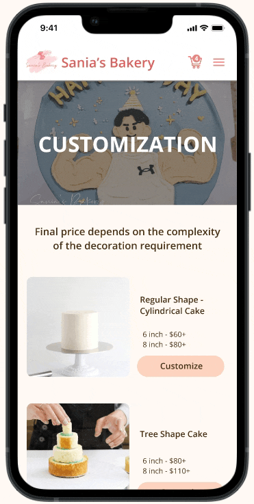
The website should not only have features to provide online ordering for regular desserts but also features for customized cakes. Based on Sania’s Bakery's requests, we proposed two ways to solve their cake customization problems:
1. A customization feature that allows users to submit customized cake order forms based on existing customization options
2. Provide a Special Request feature for users to communicate directly with the baker if they have specific design ideas not listed in the options
Step 2: User flow
I designed the user flow to construct clear and logical navigation paths for users to explore and use our product. After users arrive on the homepage, based on their decision, they can either customize cakes or order regular desserts. The website mainly consisted of 6 pages: Homepage, Customization, Online Ordering, Special Request, Checkout, and About Us page.

DESIGN PROCESS
Step 1: Information Architecture
Before creating the user flow and lo-fi prototypes, I started with information architecture, which allowed me to classify the content in a clear and understandable way and arrange it according to the relations between the content pieces.

Step 3: Lo-fi Prototypes
My team and I layout the content and functionality for the lo-fi prototypes, which allowed us to visualize the feature and also provided a high-level preview for our client to view the progress and give feedback on the product. Overall, our client was satisfied with the content, layout, and logic navigation.

Step 4: Moodboard
We created 3 Moodboards with different color schemes and typography. Because our target audience mainly consisted of females, plus our client's favorite color is pink. Thus, we decided to use pink as the primary color in order to create a sense of cute, warmth, and sweetness.

Final Mood Board
Client’s choice: animated illustration, warm color, and light pink

Brand Logo + adjectives
Color Palette
Step 5: Design Iterations
My team and I interviewed 4 users for user testing based on 4 scenarios:
1. Finding out the business background
2. Adding sweets to the cart
3. Customizing cakes
4. Sending special requests.
We conclude three key design problems within our prototypes and edit the design to be more intuitive and user-friendly:
1
Homepage
BEFORE

AFTER
Problems:
-
Overload of images
-
Lack of explanations for website
-
Causing overwhelmed feeling for users

Improved layout by:
-
Putting the “About Us” section on top of the page
-
Replacing images with short descriptions
2
Interactions
BEFORE
AFTER

Problems:
-
Users feel lost by directing to an item detailed page with the same interaction as the other pages.
Improved interface by:
-
Changing the interaction from “navigate to” into “open overlay”
-
Opens a pop-up window for item detailed pages.
3
Online Ordering Flow
BEFORE


Problems:
-
Repetitive the functionality of "Menu" and "Online Ordering"
-
The menu is the list of items, that cannot interact
-
Confusing how to order items online
AFTER


Improved flow by:
-
Combine "Menu" and "Online Ordering"
-
Users can add or remove items to the cart
✨ FINAL OUTCOMES 🎂
After several times of usability testing, communications with our client, and receiving feedback from instructors, I finalized our mobile site design with three key features: Online Ordering, Customizing Cakes, and Special Requests.
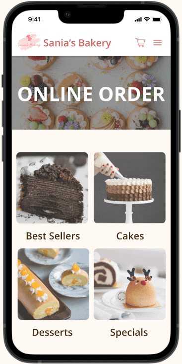
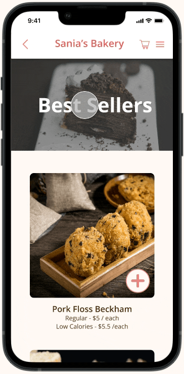
Online Ordering
-
Vertical + Horizontal Scrollable Menu
-
Clickable items
-
Add or remove items
-
High-quality item pictures with detailed item info
-
View Cart
LAYOUT

FUNCTIONALITY
Customizing Cakes
-
Customize items by filling out options
-
Add or remove items
-
View Cart
-
Click the Special Request button to direct to its page
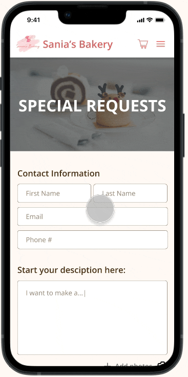
Special Request
1. Fill out the contact information
2. Write the description
3. Add or remove pictures
4. Send out the request
REFLECTIONS
Think critically and empathetically about user experience
Through the design process, I learned that it was a mistake to imitate bestselling items. I needed to think critically as a designer and develop products based on user empathy.
Communication is the KEY!
I learned that effective communication with the client is crucial for creating a successful website. Regular communication to understand the client's needs and visualize the desired interface design. Keeping the client informed throughout the project process and incorporating their feedback helps to meet their expectations.
By consistently communicating with our client, we are able to design the site within her expectations. The key features satisfy our client’s needs and carry out the main functionality of her business!